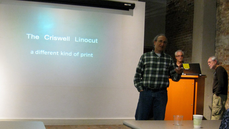
The Criswell Linocut a different kind of print |
Third Annual Society of Arkansas Printmakers Members Exhibition A DIFFERENT STATE OF MIND on Friday the 13th of March, 2015 at The Butler Center for Arkansas Studies in Little Rock |
The Criswell Linocut a different kind of print |
Third Annual Society of Arkansas Printmakers Members Exhibition A DIFFERENT STATE OF MIND on Friday the 13th of March, 2015 at The Butler Center for Arkansas Studies in Little Rock |
I was tricked into doing this. At the Cox Center show
a few weeks ago Tammy Harrington asked me if I would talk at
the Butler opening. I thought she meant a 2-minute gallery talk
like we did at the SWOP opening, and I said sure. Next day I
get an email saying “The Butler Center is delighted that
you will be giving at Artist Talk at the ASP opening. It will
be in a room with a projector, bring your own laptop.”
Say what?! I like to have at least 6 months to prepare for one
of these things so if anything goes wrong, blame Tammy. That was to be my introduction,
but everything went wrong, and it didn't seem appropriate
anymore. But on second thought ... yes, blame Tammy! The following is a reconstruction of the way it was supposed to go.... |
First I want to point out that this was my suggestion for the ASP logo. I mean, the whole reason for choosing the name “Arkansas Society of Printmakers,” after all, was so we could use a snake in the logo. Or so I assumed. And Cleopatra's asp seemed a natural. I wanted our motto to be "Art with a bite." I thought that would appeal to the etchers among us as well as the snake fanciers. And the inscription, Suum cuique venenum, to each his own poison—or her own poison—will become clear when I tell you about my linocut experiments. But this was
resoundingly voted down in favor of the harmless and more acceptable
|
|
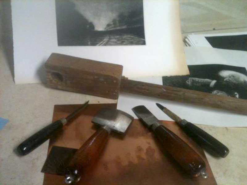
This takes a very long time because you have make an infinite number of passes in one direction, gradually working your way across the plate, and then another infinite number at right angles to those, and then another infinite number diagonally, and so forth. You can buy grounded plates, but I considered that shameless cheating.
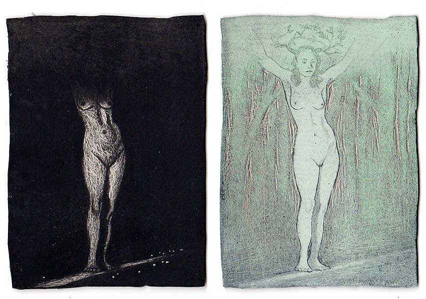
Then you use scrapers and burnishers to create your image, bringing light out of darkness. This was natural to me then because I was doing a lot of drawings in white charcoal on black paper, and in my oil paintings I also worked from dark to light, wiping highlights out of dark glazes. Danaë, I think, was my first one-- |
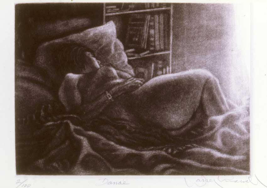 Danaë, whom Zeus visited as a shower of gold... |
||
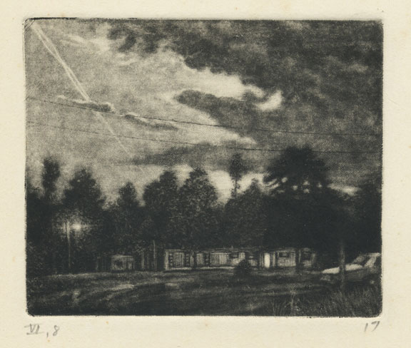 Al and Betty's trailer across the road. |
||
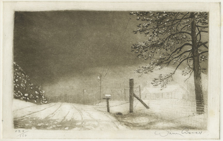
In this next one you can see the rocker marks at the edges of the image: |
||
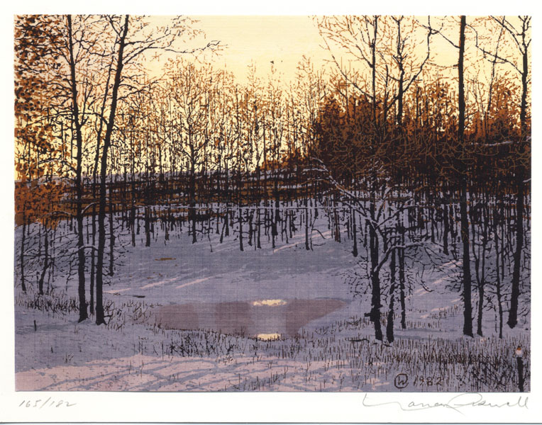
 Our backyard during a snowstorm. |
||
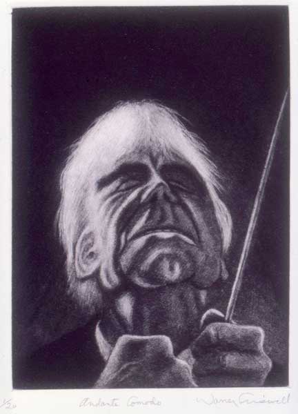
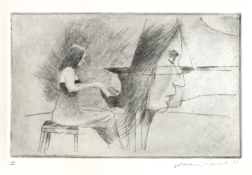
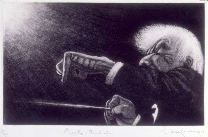
I did a series of Bernstein conducting Mahler 5, from sketches made from concerts on TV. The sketches are in my Lenny & the Black Riders sketchook. 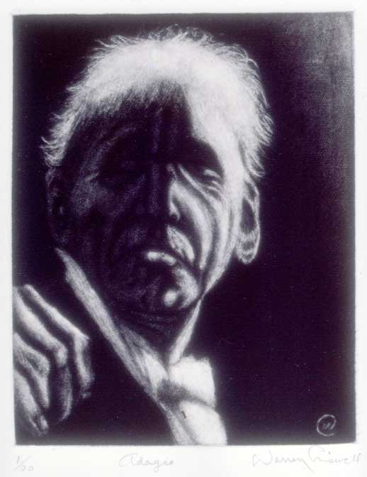 Adagio |
||
 Andante comodo |
||
|
||
|
||
This must have come from a wall of Polaroids I saw on the TV news, showing some of the faces of the disappeared in Argentina in the 1970s and '80s. Here I was associating those victims with me, members of my own family, and friends. But we all disappear eventually. This is an etching with mezzotint grounding over part of the plate. |
||
But I had trouble printing them at first, so for one of the few times that I admitted needing help, I went to see Aj Smith, who was the Artist in Residence at the Arts Center then, and signed up for his class. It was actually a lithograph class but he made an exception in my case and taught me how to wipe the mezzotint plates. Coarse tarlatan, then fine tarlatan, then the hand wipe. Aj taught me a lot and I still go hunt him down whenever I have a printmaking problem. I also got some valuable technical advice on intaglio printing in general from Evan Lindquist - now Arkansas' first Artist Laureate! But mezzotints took way too much time and I got into other intaglio methods - etching, aquatint, engraving - this is a little engraving: |
||
 (You can see how small it is from the plate marks) |
||
--and also relief printing, starting with wood engraving, inspired by Dore's illustrations of Dante's Inferno and the Bible. This is done with engraving tools on the end grain of boxwood blocks. Here's a small one: |
||
|
||
Then I did some linocuts-- |
||
|
||
|
||
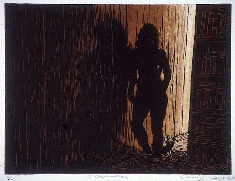 A Conversation, 2-color linocut |
||
Then I got into acid - speaking of poison. No, not that kind - I mean hydorcloric and ferric chloride, for etching copper plates. Here's one of Martha Agerich, I think - another Argentinian. Again, from a sketch made from TV. |
||
 |
||
|
||
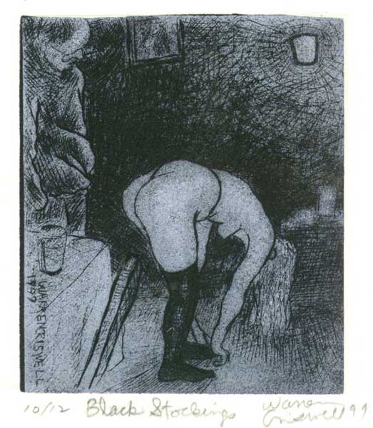
And here's a drypoint : |
||
|
||
|
||
|
||
I learned 4-color process when I was in commercial printing, and for this and the next one I used the four process colors - magenta, yellow, cyan and black - one plate for each color. The black one is called the key plate, a term I'll adopt later for my new linocuts. |
||
This one is only 3 x 5 inches. A demonstration of how vastness can be depicted in very small formats. At least one case where size doesn't matter. |
||
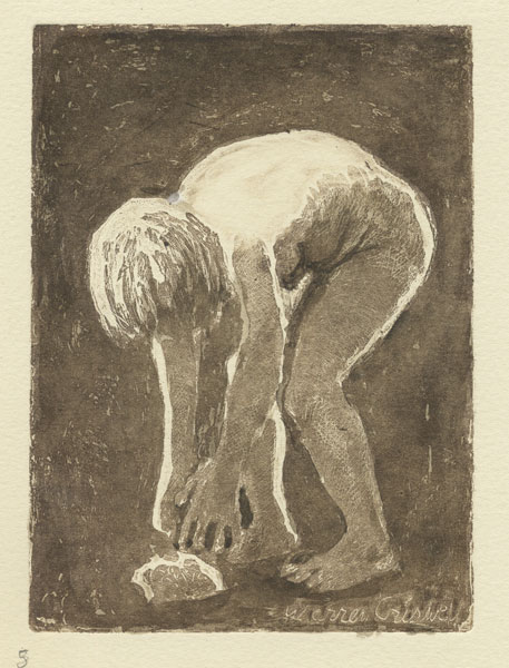 Woman Picking Up a Rock |
||
|
||
But all these took a lot of time from my painting and the acid was a problem, venting the fumes out of my studio - oh, and I even did some screen prints, which took even more time and space, making the screens and mounting them on my drawing table. Here's a12-screen print: |
||
|
||
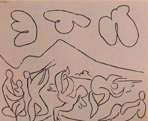
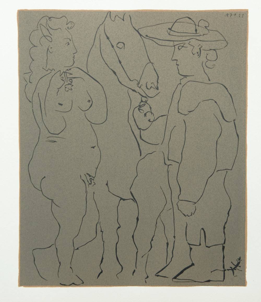
This is our backyard and I used this one for a Christmas card in 1982, the year a tornado destroyed our trailer and blew our bus over - but that's a whole other story. Then one day Sammy Peters showed me a book of prints by Picasso. Sammy has given me a lot of technical tips over the years and this was a big one. I had seen the prints that Picasso and his printer Arnera made in Vallauris in 1959, but now Sammy pointed out some of them that didn't look like linocuts, and I knew immediately that this was something I had to try. Here are two of them: |
||
You can see that Picasso cut the lines themselves, rather than cutting away everything but the line as in traditional woodcutting. |
||
|
||
It was a simple time-saving trick: Print a solid black ground first, then cut your design with a v-gouge and print it over the black in white ink - or some other color as long as it's pale and opaque. The cut lines show through as black! So I tried it, and it worked - after a while. |
||
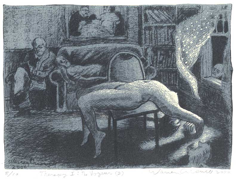
You can see that I started cutting this with a gouge, but after a few lines, on a whim, I picked up a diamond-point drypoint needle that happened to be lying there on my work table, and gave it a try. That opened up this whole idea to something way beyond what Picasso did with it. From then on the drypoint needle - I found I didn't need a diamond point, the cheaper carbide point works just as well - became my primary tool for this technique. It raises a burr on the linoleum just as it does on copper, but since it's not wanted here, I remove it with fine steel wool. For bolder lines I use gouges or an engraver's burin, but it's mostly all needling all the time. So here are a few of my early ones: |
||
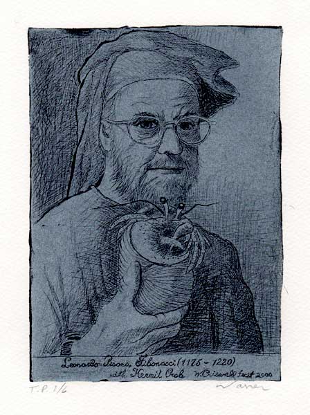
Me impersonating the Medieval mathematician who discovered the Golden Spiral, along with a hermit crab impersonating a nautilus who had discovered the Golden Spiral long before Fibonacci. |
||
|
||
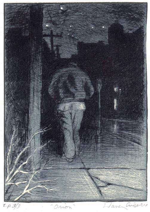
This one has some cheating. See the white charcoal heightening in the negative spaces? That wasn't necessary, and that was the second thing I discovered and that Picasso had missed: highlights can be cut into the ground block, as in Orion: |
||
And Moths: |
||
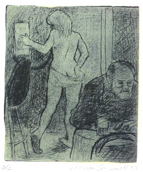
 Here I started experimenting with different colors. |
||
Remember this shark. It will return later. |
||
Here's the second version of Lynn on the Phone, now with the highlights cut out of the ground block:
|
||
So I'm calling the main components of this technique the key block and the ground block. After cutting the design on the key block, I pull a proof and print a counterproof on the ground block so I can see where to cut the highlights. |
||
(from Genesis) |
||
|
||
|
||
(Inspired by the opera Arald by Nicolae Bretan) |
||
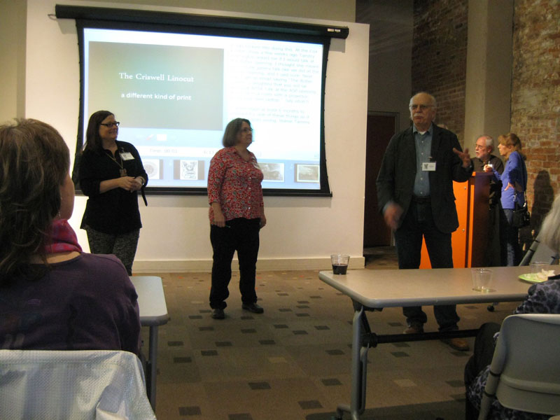
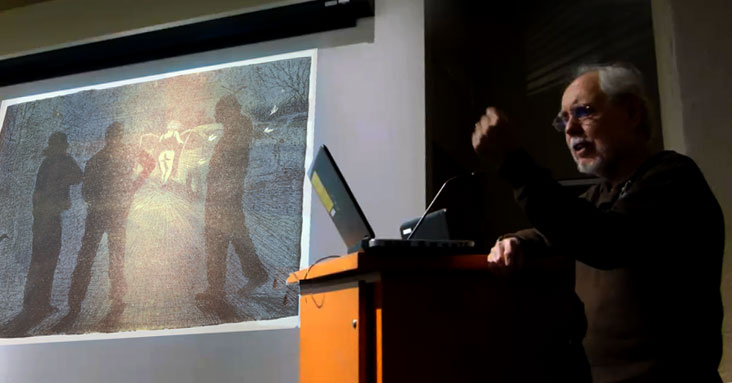
(I had a shortened version of this in my PowerPoint presentation at the Butler center but it wouldn't play, so you can skim through this enough to get the idea.)
|
||
|
||
Anyway, once all that was worked out, plus a good method of registration, I found I could draw freely on the linoleum in more or less the same way I draw with a pen or pencil on paper and that all those lines, no matter how fine, would be preserved in the print. This is exactly what I wanted to achieve in printmaking - without having to go through all the time- and space-devouring routines of intaglio or lithography. I found that with this kind of printmaking I still had time for my painting and sculpture, which was never the case with my other printmaking media.
Another thing I like about this method is that I can get a 3-color print out of two blocks. No printer's ink is completely opaque, so the overprinting of the light color over the dark ground produces a third color, and where it prints over the highlights cut out of the ground it appears in its true color. If you cut some of the highlights out of the key block, you get a fourth color, the white of the paper, as in "A Woman Lighting a Joint." |
||
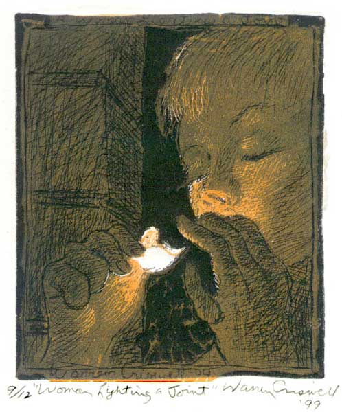 The flame is cut out of both the key block and the ground block. |
||
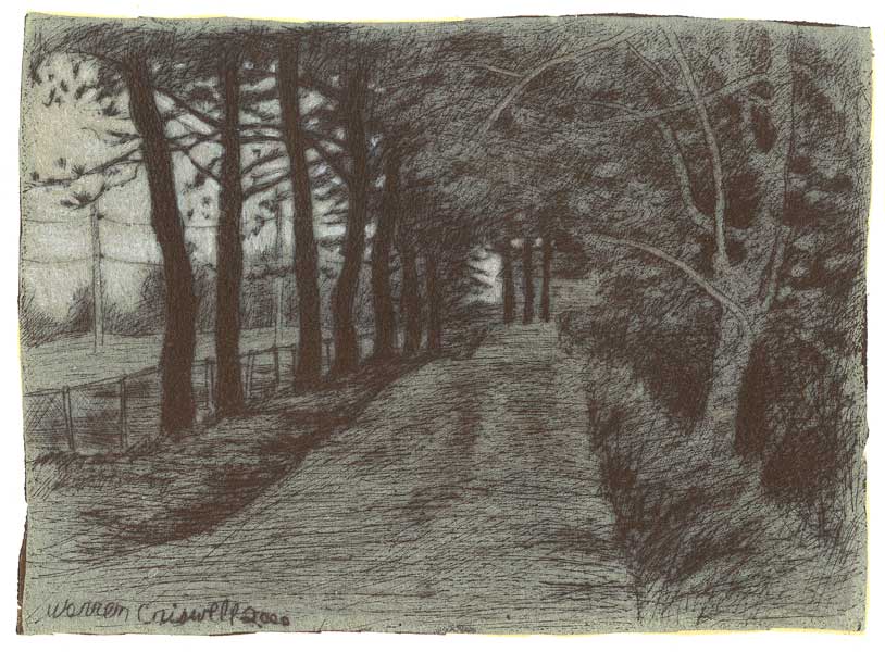
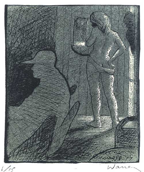
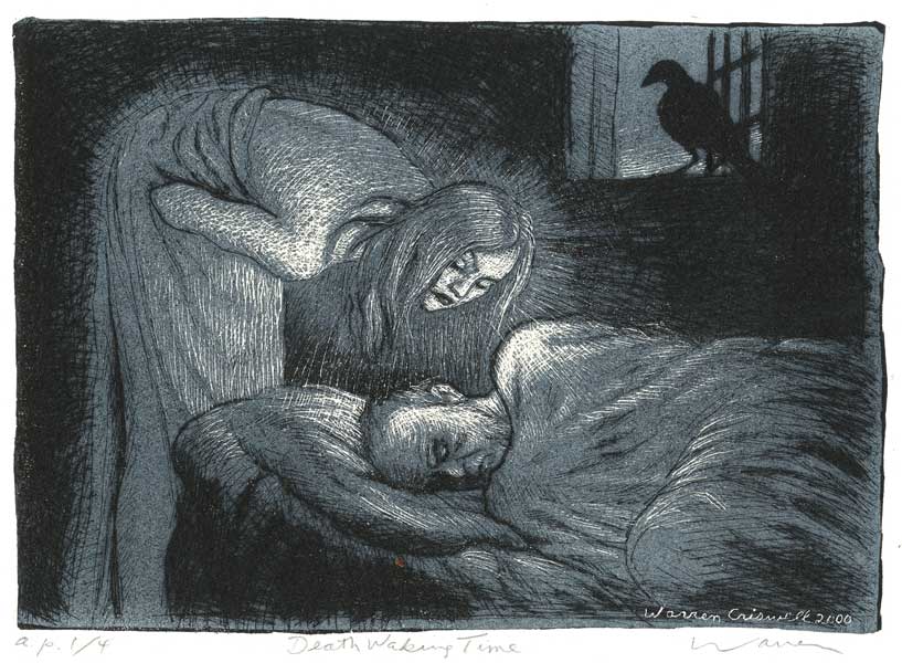
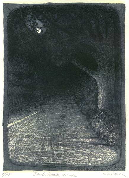
So those are some of early ones. This one is called Dark Road with Tree:
Here are some more recent ones: |
||
|
||
|
||
|
||
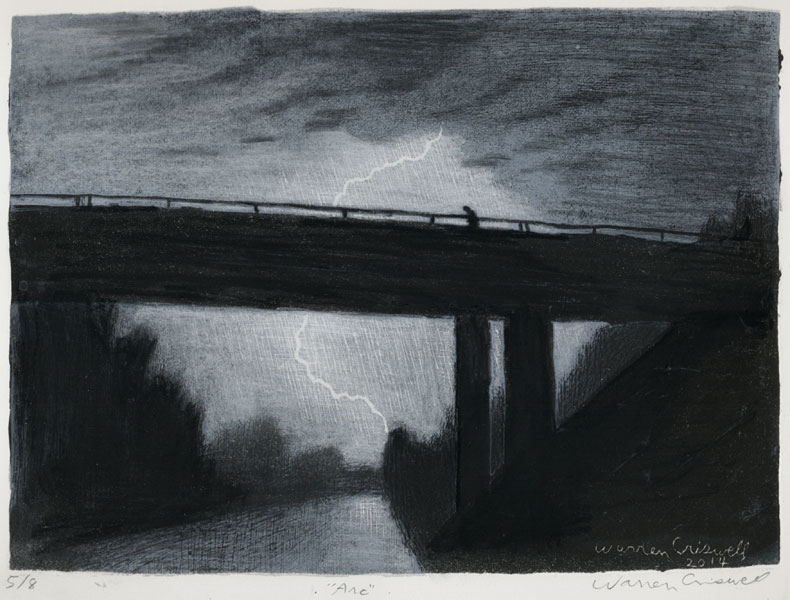
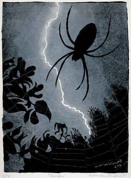
This garden spider had spun her web across our dining room window and stayed there for about a week, seducing at least three lovers to their liebestode. We called her Miss Itsibitsy. Adding the guy in the web was an afterthought, just like the guy on the bridge in Arc. The drawback of this method is that everything has to be just right - ink, paper, pressure, etc. - or it won't work. And each print has its own idea of what "just right" is. But after all that's pretty much the case with any print medium. Suum cuique venenum. In the more recent ones I've adding some new poisons to the mix. This is a drawing I made at a workshop David Bailin did at Pulaski Tech a few years ago: |
||
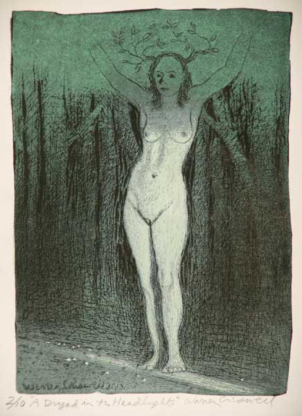
 A Dryad in the Headlights, charcoal and white charcoal on green paper |
||
It was one of those rare moments when an exercise suddenly becomes something more serious. David had the model holding a pair of antlers on her head ... which just didn't seem right to me. So I changed them to tree branches and called it “A Dryad in the Headlights.”
(Note: At this point, when I was giving this talk at the Butler, I saw somebody out there waving their hands but couldn't see who it was in the dark. It turned out to be the model, Jennifer Perren! The dryad in the audience! How cool is that? She was also the model for my Angry Birds sculpture - and a printmaker, member of ASP with work in this show.)
So after doing the Dryad drawing, I couldn't resist attempting a linocut of it. But catching all those subtle contours of flesh, and the blending of green, black and white, were things I’d never tried before with this technique, so it took a lot experimenting with ink, and I ended up using selective inking of green and white with small brayers, something I'd never done before. Here are the blocks:
|
||
 |
||
And here's the print: |
||
|
||
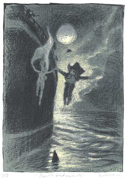
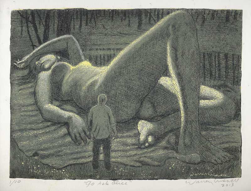
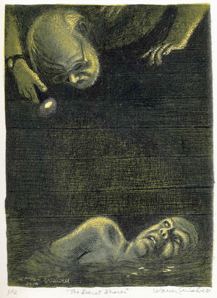
I also did a painting, a watercolor and a sculpture of Alice. When I get an image I milk it for all it's worth. The image for one of the prints in this show came to me one night when my wife mentioned Joseph Conrad's story "The Secret Sharer," which I had read years ago. |
||
|
||
Basically, this is an encounter between the captain of a sailing ship and a swimmer he discovers one dark night, a fugitive from another ship. This guy is on the run, or the swim, having committed a crime on the other ship, but the captain immediately thinks of him as another version of himself, a doppelganger. The idea is that the captain has safety and security but no freedom, while the swimmer is in great danger but he is also free. It's the old dichotomy of security vs. freedom, always a problem for artists.
So I intended for the face of my swimmer, even though he's down there in the water with the sharks, to have a sort of smirk on his face, and when I modeled for it I videoed myself with this smug, evil grin. But when I painted it, it didn’t come out that way. The brush took over, as so often happens, and this terrified face emerged! Not what I intended at all- and certainly not what Conrad intended - but then I realized that this was the truth in my case, so I left it that way. I'm too old to swim with sharks. Often the artwork is more truthful than the artist.
Lately I've been pushing the limits of what's possible with my linocut method, and one print failed completely. The other one that has given me a really hard time is the other print in this show, "Revelation."
|
||
 |
||
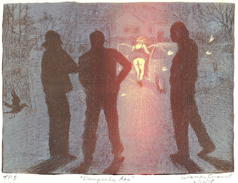
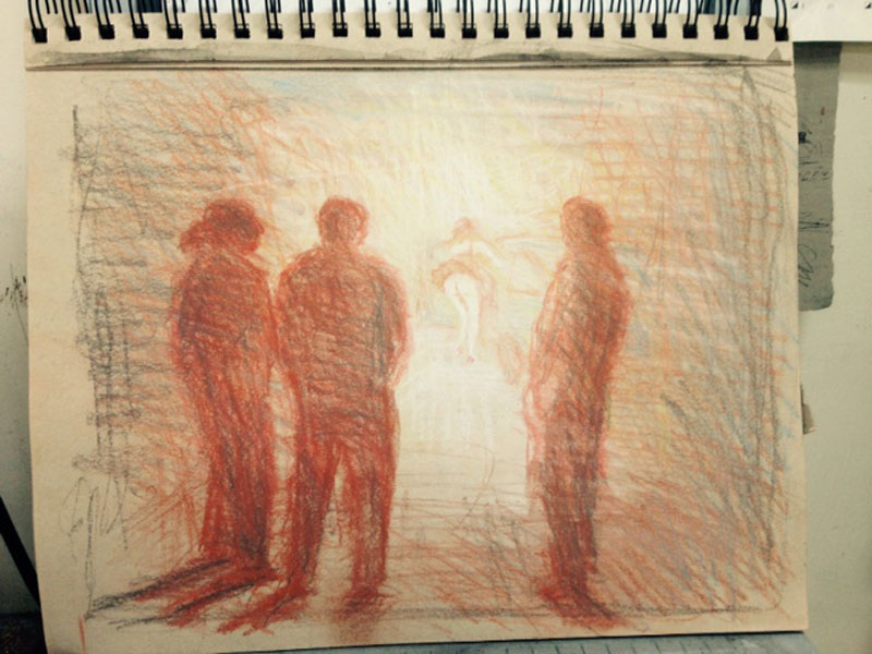
Now wait, this isn’t the final print, it’s an early trial proof. I’ll explain, but first, I guess I should tell you how this image came to me. I talk metaphorically about being ambushed by my images, but this really was an ambush—though not a deliberate one—as far as we know.
David Bailin and Steve Whiteaker and I were standing outside Damgoode Pies on Kavanaugh after lunch one windy day a few months ago, when this girl comes out of Pies and walks past us, and when she was getting into her car ... this happened. We had been talking, brooding about our sick and dying dogs and our various physical ailments, really down, and this immediately lifted us out our gloom.
It was like a gift from the gods. It was like that story that Sam Spade tells in The Maltese Falcon (by Dashiel Hammet) about the guy who just missed getting crushed by a steel girder that fell from a building. He said it was like somebody had taken the lid off life and let him look at the works. Steve said he was going to go home and rethink his entire life.
So this was a moment I felt needed to be preserved from the ravages of time. I had no other images so I started working on an animation:
|
||
|
||
|
||
|
||
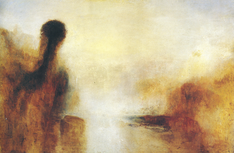
And I suddenly realized what Turner was telling me: The girl should be the light source! A sun goddess, burning though our depression! So I ran upstairs to my studio and drew this sketch: |
||
|
||
But instead of doing a painting first, as I probably should have done, I decided to try a print. I'd never done one like this before, with this kind of color, and I did a lot of experimenting and had a LOT of trouble--trying to roll a red ground in the center of the block with burnt umber surrounding it, and had an awful time getting good solid coverage, but finally I thought I had something that would work, so I ran about a dozen grounds. But when I started running key block over them--also a tricky inking, yellowish in the center so it would produce an orange when overprinting the red ground, with white on the sides--the first one I printed was the worst of the ground proofs, with the red all flakey --this was just to get started, checking the ink on the key block-- and pulled this proof: |
||
 |
||
Whoa! An explosion of light! This was another gift, one of those happy accidents that you could never do on purpose. (Somebody on Facebook thought the title should be "The Gift.") So then I wanted all of them to look that way, so I reran the grounds, trying to replicate that lousy color, and though I pulled a few successful ones, I'm still working on the edition and so far have only a dozen trial proofs to show for it.
|
||
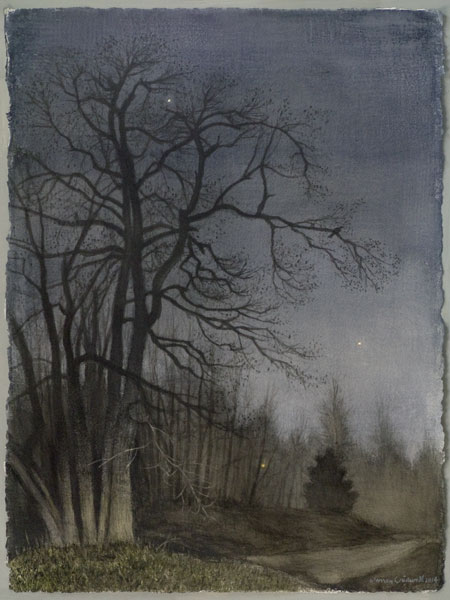 Alignment (6 A.M.), 2014, watercolor, 30 x 23 inches |
||
So let me end with a short demo of the making of a Criswell linocut, "Alignment (6 AM)." This image came to me one morning last April when I was taking my sick dog Tizzy out. I was standing at the dining room window , which overlooks the dog pen, waiting for Tizzy, when I noticed this bright red star or planet up in the west. Then, as my eyes grew more accustomed to the dark, I saw another star off to the left, higher up. And down below, across the street, was a neighbor's yard light, and tracing these three lights on window with my finger formed a parabola, a curve that often turns up in my work. I looked at my watch and it was 6 o'clock, DST, so it was actually 5 o'clock, just at the edge of dawn. And only then did I see the tree! - this sweet gum towering over the house! - which will someday fall on the house if we don't do something about it.
This an example of what I usually mean an ambush—something I've seen a thousand times before—unlike that last one—but never as an image until that moment. So I checked my sky map and sure enough, it was Mars—so bright because this was within a week one of its closest approaches to Earth—and the other star was Aldeberan in Taurus. And besides all that, this was the morning of April 8, 2014, when Mars, Earth and the Sun were in perfect alignment, so that as Mars set, the sun would rise. So it all came together. All I had to do was add the crow in the tree to fill out the parabola.
So I did this watercolor (above). But when I got to the print - |
||
w.jpg) Alignment (6 A.M.), 2014, linocut, image 10 x 7 inches |
||
-- I again had to do some different things than my usual linocut technique. So here's the video. Listen to the sound at the end and I'll tell you what it is afterward. |
||
That sound is the background radiation of the universe, the remnants of the Big Bang converted into sound. This is the music we heard that day in the parking lot of Damgoode Pies when the wind lifted that skirt and our spirits. Suum cuique venenum! Thank you very much, ladies and gentlemen. |
Home..... Studio.....Paintings.....Watercolors.....Sculpture Prints.....Animations.....Videos.....Drawings.....Exhibitions Collections.. ....Essays.......Reviews.......Cantrell Gallery
|

.jpg)
w.jpg)
-1834.jpg)